|
|
Post by IceboyForHire on Aug 23, 2005 12:53:31 GMT -5
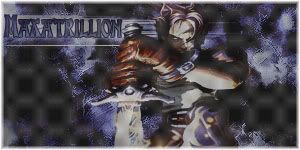
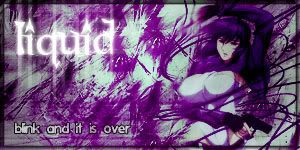
anyways guys, what about my 2 latest conflict sigs
|
|
|
|
Post by -Jackson- on Aug 23, 2005 13:10:10 GMT -5
i found it anyways...thats kinda a difficult pic to work with......its the one with the guy standing on the panther.gargoylish head thingy right? Yup! that would be the one. |
|
|
|
Post by -Jackson- on Aug 23, 2005 13:14:20 GMT -5
Ice, the 1st one would probably look better being a multicolor sig and the 2nd one is kinda plain jane dude, black and white just doesn't make a good sig. but that is just my opinion. But I'll tell you something you might try on the 2nd one, add some graffiti looking text in the background. Using pink, neon green and colors like that would be the shit. Maybe have it on a brickwall background.
|
|
|
|
Post by liquidarmz on Aug 23, 2005 16:11:41 GMT -5
i'm impressed with you development in the last couple of weeks.
|
|
|
|
Post by IceboyForHire on Aug 23, 2005 17:33:15 GMT -5
is this better  |
|
|
|
Post by -Jackson- on Aug 23, 2005 17:49:51 GMT -5
now that's what I'm talking about!!!
|
|
|
|
Post by IceboyForHire on Aug 23, 2005 20:29:18 GMT -5
it took me a while to find the right graffiti pic to use, the bricks were easy, but the graffiti was hard, cause it had to be the perfect one.
|
|
|
|
Post by el JOKER5 on Aug 24, 2005 19:11:24 GMT -5
there you go ice. you are getting the hang of i now. i like the new style of work. GJ
|
|
|
|
Post by IceboyForHire on Aug 30, 2005 21:33:39 GMT -5
|
|
[HIT] DarthBulls
Allied Member
DONT TURN YOUR BACK ON THE DarkSide !!! I know the path to the DarkSide
Posts: 81
|
Post by [HIT] DarthBulls on Aug 31, 2005 18:38:56 GMT -5
very cool sig's
|
|
|
|
Post by IceboyForHire on Sept 2, 2005 13:37:30 GMT -5
this is my newest, i tried it with a smaller size but it just didn't work for me.  |
|
|
|
Post by el JOKER5 on Sept 2, 2005 15:20:13 GMT -5
sorry, ice just aint feelin it. the size, color shceme, brushes. after making some real good one's, it's like you went back to your old style.
|
|
|
|
Post by -Jackson- on Sept 2, 2005 15:46:15 GMT -5
lmao, same here ice, you were doing soooooo good brotha  . |
|
|
|
Post by IceboyForHire on Sept 2, 2005 16:05:05 GMT -5
1st off, my old style, i didn't use brushes, 2nd of all the color scheme of the Autobots is red,white, and blue, and the color scheme of the Decepticons is purple,green, and gray, and 3rd of all this style is much better, i downloaded brushes from deviantart and used some grunge brushes, there's only so much that u can do with black pictures of the two sides.
i only found one good picture of Optimus Prime but i couldn't find one of Megatron, if i could have then it would have been 350x150, but i couldn't so i didn't.
i know that u're not being mean but the only thing that is like my "old style" is the size of it, it took me a couple of days to figure out how i was going to make it look.
also, what do u think about the sigs that i made on the 30th.
|
|
|
|
Post by -Jackson- on Sept 2, 2005 18:10:07 GMT -5
2nd one is nice, 1st one looks like it could be used as a recruiting poster for the rainbow warriors if you know what I mean! . 2nd one I like the swirls in the middle, don't like the outline on the renders though, never seen anything like it. |
|


![[HIT] DarthBulls Avatar](http://www.ukrockers.co.uk/nuke/modules/Forums/images/avatars/gallery/Star_Wars/Star_Wars_-_Darth_Vader.gif)


 .
.